Accessible design is about people. Real, honest to God, human beings. They are our friends, neighbors, and even ourselves.
This is not a technical article, about how to implement accessible designs. It’s about the thought process content creators should go through to make their content useful to as many people as possible. For those of us who don’t use assistive technologies on a regular basis, creating accessible content can be an abstract concept. We get tempted to focus on passing the scan, avoiding law suits, and generally treating accessibility as a checkbox. It is easy to forget that making your content accessible is about making it useful to people.
I’m not the greatest expert in the world on accessibility. But when I recently noticed a gap in Salesforce’s training materials it drew me back into thinking about the details. Instead of focusing on the strict rules of compliance I have been focused on making sure the content is actually useful.
Accessibility Gaps
During a discussion at the Open Source Commons Sprint in Denver this past November several of us got into a discussion about why so few people in the room knew how to make sure their screen flows and other custom elements were built to be accessible. The room was full of people who know the platform extremely well; if they don’t know how to do this then most Salesforce administrators don’t know.
When I am in a room of experts who have a common point of confusion, I assume there is a problem to solve. The exact problem isn’t always immediately clear, but the existence of one is. If people with 20 years of experience on the platform, which is rightly known for taking accessibility seriously, don’t know how to keep it accessible: there is a problem.
Salesforce’s Trailhead site provides good content about accessibility. So how then does the community not know how to put this information to work?
Closing the Gap
Fortunately, one of the people in the room not only creates that material, but is responsible for helping ensure the content is high quality. Kelly Hamilton immediately took it upon herself to review the Trailhead content on accessibility. Kelly found, and started to address, some specific weaknesses in the existing material but the immediately obvious gaps were small. They didn’t explain the lack of understanding in a room of experts.
I wasn’t convinced the gap was in the material directly about accessibility. I offered Kelly the next challenge: does content that is not focused on accessibility encourage accessible practices? She held my feet to the fire and challenged me to help check. That answer turns out to be far more mixed.
The core issue I am finding is not specific to Salesforce. Trailhead’s content, like many other similar resources, is divided into content about accessibility and everything else. That means articles about how to create custom elements do not consistently encourage practices that ensure the platform stays accessible. Writers take unneeded short cuts to keep the content simple. The writers also often assume the people completing tasks are not using assistive technologies themselves. The description of how to complete the task technically meets accessibility standards, but there are details missing to complete the task for many people who need those standards to exist.
Instead of having best practices for creating accessible content be a background hum, the content builds in assumptions that unintentionally send a message that accessibility is an after thought.
A Quick Example
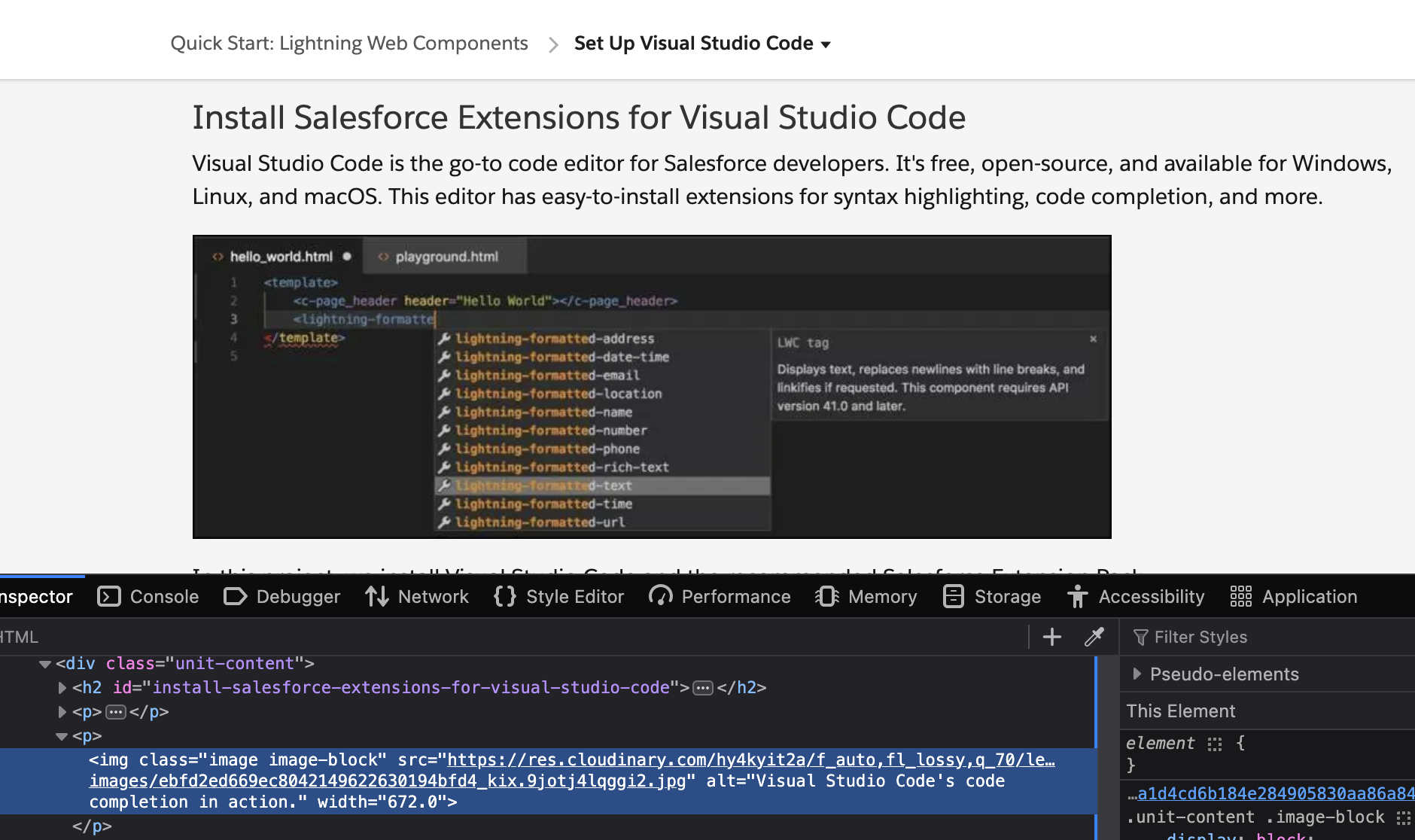
One of the articles I recently reviewed covers setting up VSCode for Salesforce. At the moment there is a screenshot at the top of the page that shows what VSCode looks like when providing code auto complete (I reported a number of issues with this unit so it may change in the future). The alt text reads “Visual Studio Code’s code completion in action.” While technically accurate, and it certainly meets formal standards, it is completely useless to a blind user wanting to learn to use VSCode with Salesforce.

The Trailhead unit is a training article for people getting to know these basic tools. It assumes the reader hasn’t even installed VSCode yet. Nothing about the article tells a blind user what to expect from auto complete. Heck, it doesn’t even acknowledge that one of the reasons to use VSCode is that it provides support for screen readers or where to get training on use that mode.
The implicit assumption is that the reader is sighted. Accessibility support is therefore provided as a kindness (or for legal compliance) to an audience that would not actually use this instruction. Nothing about this article directs that segment of the audience to content intended to help them succeed.
In my experience a great deal of material on the web about creating good content suffers from the same faults. The implicit assumption about the audience is that they have no relevant disabilities themselves. Meanwhile, articles that aren’t focused on accessibility frequently skip the details required to make the demonstrated technique meet accessibility standards.
Why Accessibility Gaps Matter in Training Docs
There are two groups of people to whom it matters that training materials be correct: people who need assistive technologies to work, and people who care about people who need those technologies to work. In an ideal world that means everyone.
For people who need screen readers and other assistive technologies, accessibility is much more than a checkbox. These technologies help keep people engaged in the world around us and able to productively contribute to our community.
Just to make the situation ever so much more so worse: we are all training AIs through everything we publish. When our content fails to encourage accessible techniques in everything we are training those machines that accessibility doesn’t matter. Doubt that? In November 2025 Microsoft published a set of test results that found that even the best tools only create passing content 30% of the time. Those LLMs were trained off the same material we use to train humans.
It matters to people; it matters to machines; it matter to people who trust machine.
It matters to everyone.
Leveraging Your Empathy
Content is for people – even if machines steal use it to create money content for others. Creating good content requires thinking about your audience and how they experience your content.
A mistake often embedded in efforts to create universal designs is that advocates will at times argue to create the same experience of all users. When possible, that’s great! But that’s rarely possible in practice. The experience will never be the same for the person relying on a screen reader to read an alt-text as it is for the person seeing the image. Don’t pretend you’re doing the impossible. That’s not being empathic to different perspectives, it is denying the realities of our world.
Empathic Alt-Texts
As one thought experiment let’s look at alt-text. They are the first thing most people are taught to worry about when creating accessible content. That training nearly always focuses on describing the image.
I am advocating for a different starting point. When writing alt-texts try to put yourself in the place of someone encountering that text. Consider what they need to know about the image in the context you selected. Think less about the image, and more about its purpose.
What meaning is it conveying to a sighted reader?
How can you ensure that meaning is conveyed to all audiences?
If the purpose of the image is to convey a feeling, try to convey that feeling. If it is meant to convey information, provide that information (or better yet put it in the caption for everyone).
Ask yourself what you would want to help yourself understand this content. Is the image there to provide a visual break in necessarily dense content? Okay, then make sure the alt-text gives the user a mental break as well. If the image is silly, tell a joke. You gave you sighted audience a reason to smile, give that to your blind users as well.

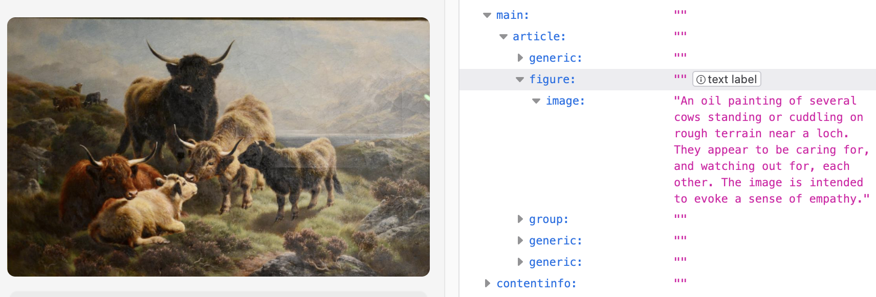
When I wrote the alt-text for the header image, I wanted to help make it clear why that image was part of this article. I tried to include not only some sense of the image content but also the emotional reasoning for selecting it. Hopefully for those who saw the image all that was clear right away but for everyone else I still wanted to provide that detail.
What This Doesn’t Cover
No one approach addresses all needs in all contexts. We cannot close every gap.
There are places where no matter how much you care, it’s really hard to create proper parallels. Descriptive audio is really hard to create and should be done by experts when possible. Creating teaching materials or tests where students need to struggle with a piece of art to find details and understand its meaning is even harder. That does not mean we don’t try.
We should do our best and strive to improve over time. If we pretend everyone can provide all the accommodations equally well – or that AI will magically free us from this challenge – we hold back the push for further improvements. Many universities are doing this right now when they tell their professors to handle all accessibility needs for online classes without providing the needed resources. Even worse, they often tell those professors to remove valuable content if the office staff don’t know how to make it accessible. Harming everyone is not the right way to make progress.
Do what you can. Admit when you cannot be as good as you would like. And use that admission to get better, push for more resources, and support technical improvements.
Helping Out
If you’re interested in helping me review Salesforce’s Trailhead content, or just find something that needs review and improvement, contact me through the Trailblazer Community, Ohana Slack, or LinkedIn.
Accessibility bugs can be reported directly through the Share Your Feedback button at the bottom right of each unit. I’m happy to help get attention of those issues if your alert me to what you encountered. If you think you found something more subtle, where it works in the technical sense but is done poorly, please reach out and I’ll help your feedback reach the right people.
For what it’s worth I also know this blog is less than perfect in this regard. I have been improving it when I notice issues, but please feel free to send me suggestions about what is causing the most pain so I can prioritize fixing it.
